As the previous console generation came to an end, we saw the release of several games that pushed the envelope in terms of technical achievements and immersive gameplay. Two titles that really stood out for me were The Last of Us Part II (Naughty Dog) and Ghost of Tsushima (Sucker Punch Productions). Both games are incredibly immersive thanks to their powerful narratives, engaging gameplay, sound design and (most of all in my opinion) their UI. My previous post is a brief introduction to the types of immersive UI used in games, and this time around I’ll focus on 9 examples from TLOU2 and GOT.
Game overviews
TLOU2 is an action-adventure featuring survival horror elements that is set in a post-apocalyptic America. The game is played from a third-person perspective and although for the most part is a linear experience, it does have large levels and an open-world section allowing for a range of playstyles and approaches.
TLOU2 is a phenomenal game, it’s approach to storytelling and evoking empathy from the player sets a very high bar for all emotionally driven narrative games that follow it. Naughty Dog’s dedication to realistic gameplay and world details, along with the underlying core themes of revenge and retribution, make it one of the most thought-provoking and immersive games I’ve ever played.
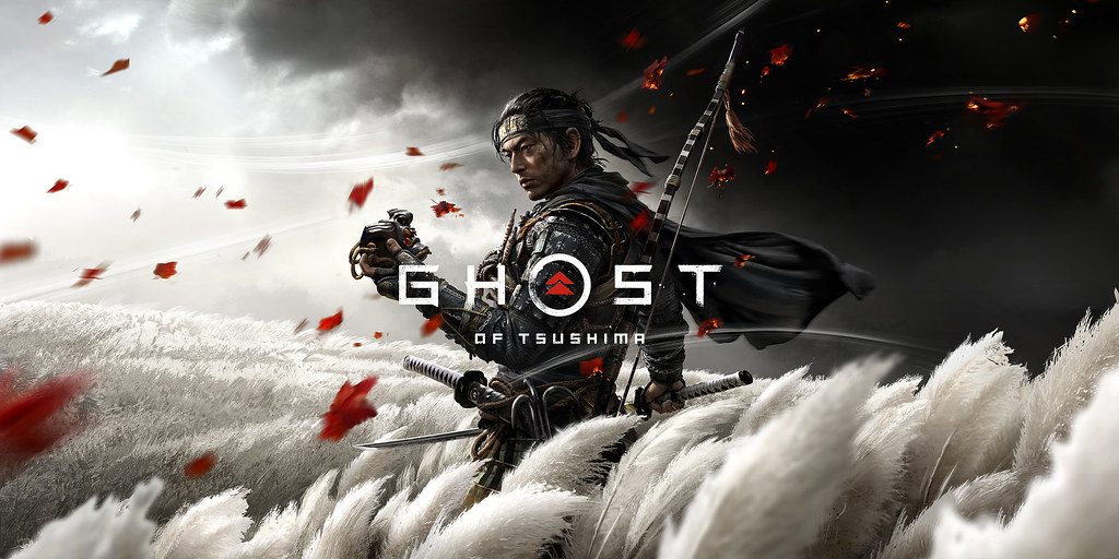
GOT, also from a Sony first-party studio, is an open-world action-adventure set during the Mongolian occupation of Tsushima island in the late 13th century. The Japanese island is fully explorable and the third-person perspective (similar to TLOU2) allows the player to truly appreciate the detailed environment.
This game bowled me over with its well-paced story, minimalist UI and outstanding art design. It’s a game that rewards curiosity through exploration, and its unique take on open-world systems make it a truly rewarding experience.
9 examples of immersive UI
1. Minimalist HUD – both titles
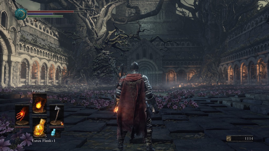
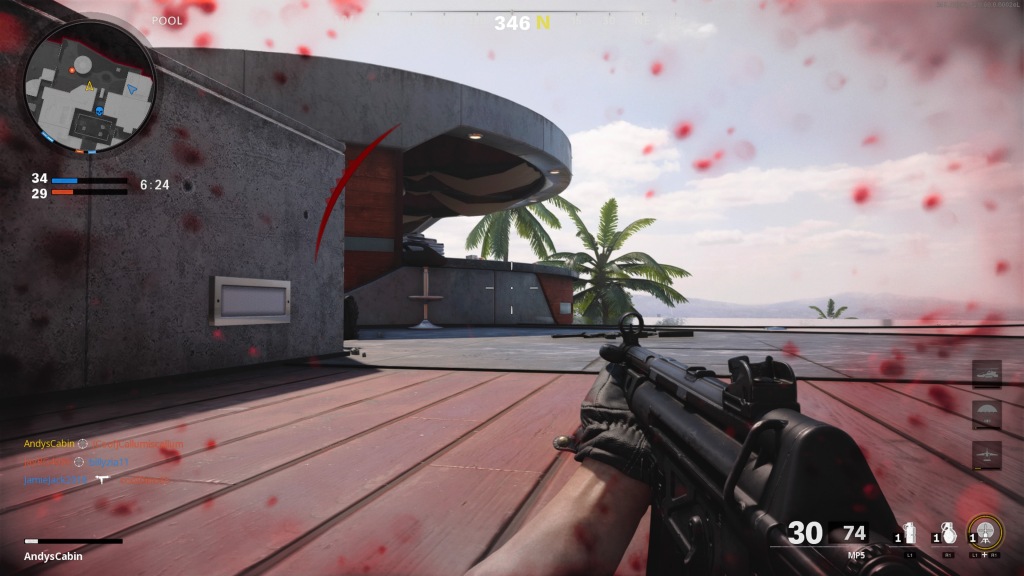
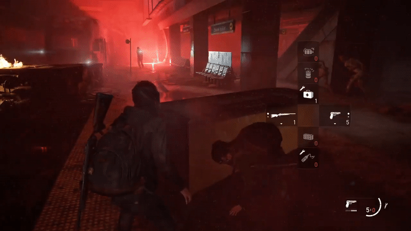
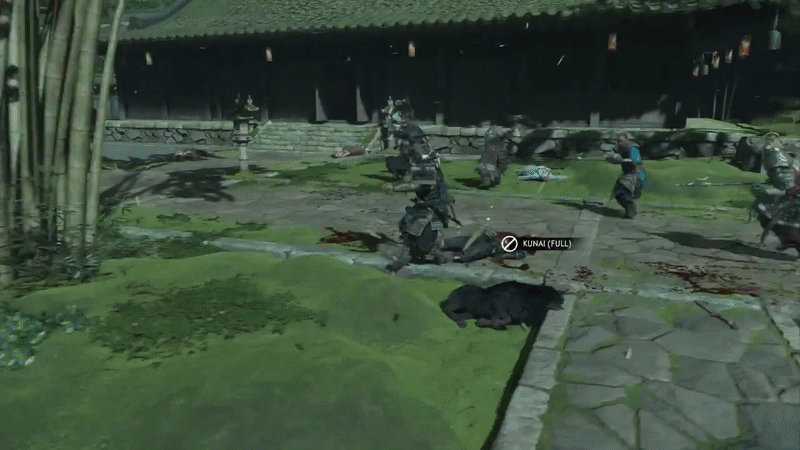
Both TLOU2 and GOT have a Heads-up display (HUD) that is discreet and shows only the most useful info (health, ammo, current weapons, sword stance etc.).
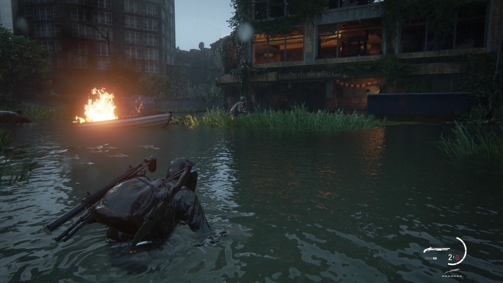
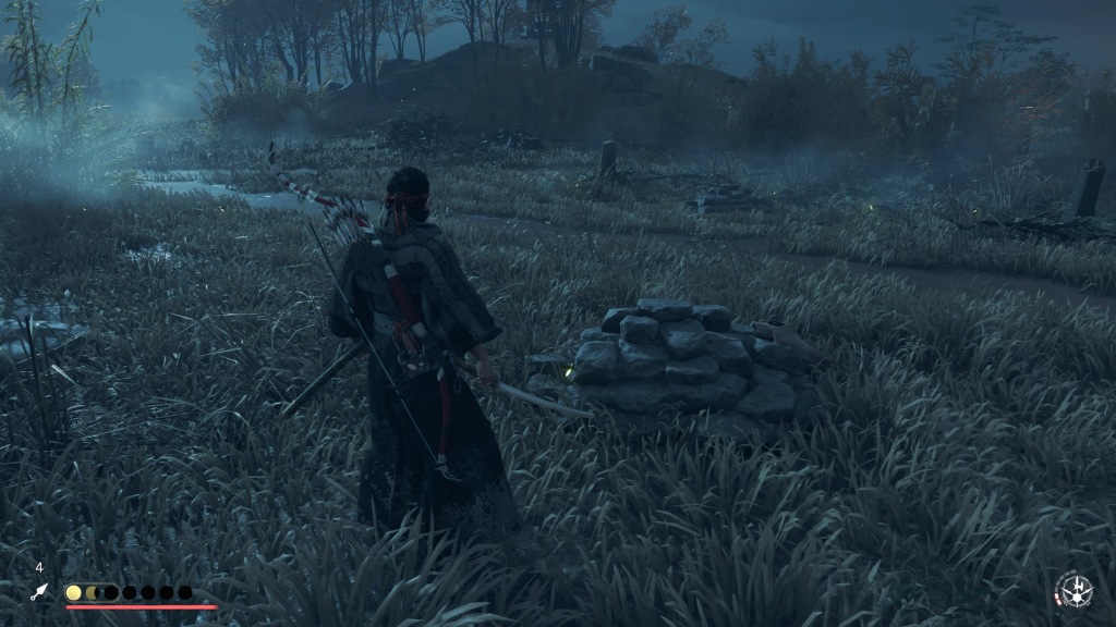
When not needed (such as outside of combat), the HUD disappears along with other onscreen icons making for a more cinematic experience.
2. Navigational Tools – Ghost of Tsushima
GOT stands out among open-world games for not having a mini-map or compass to direct players where to go. Instead, the innovative guiding wind mechanic (represented in the game’s 3D space by gusts of wind and blowing leaves) assists the player in reaching their chosen destination.
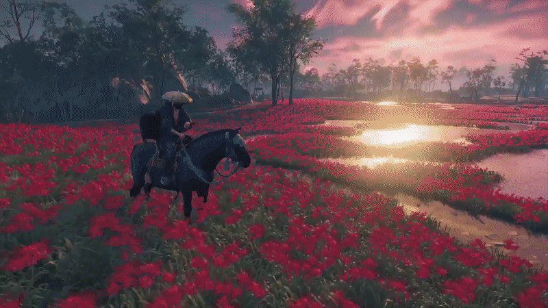
The guiding wind doesn’t feel out of place and fits the game’s setting and narrative. Interviews with the game’s developers reveal that the team took inspiration from famous Samurai films, which featured wind and movement, as well as the historical link between wind and the fate of the Mongol’s invasions of Japan.

In addition to the guiding wind, the developers wanted players to look into the game world for things to do. Throughout Tsushima you’ll find guiding animals (foxes and golden birds) that lead you to nearby points of interest.
Navigational Tools – The Last of Us Part II
During the early part of TLOU2, there is an open-world section where the player can choose in which order to complete the main objectives: find gas, start the generator and open the gate. Also without a mini-map or compass, the player uses an in-game map of the area to navigate this section.
This results in a more realistic and engaging approach to exploration as Ellie (your character) will update the map and add notes in real time as you visit each location.
3. In-game visual clues – both titles
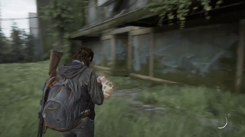
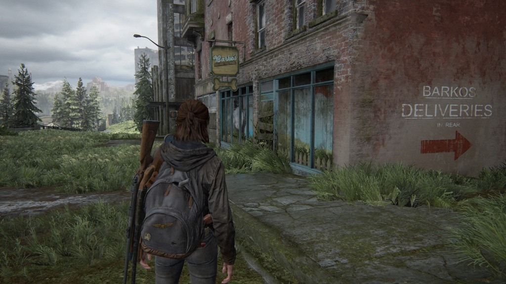
Both titles include visual clues in their environment; in TLOU2, which is mainly set in post-apocalyptic Seattle, the use of signage and a contrast in colours help the player to find points of interest in the environment.

In GOT, rising columns of smoke direct players to nearby quests and locations. This also fits the game’s depiction of feudal Japan and the Mongols’ brutal occupation of the island.
4. Collectible items – both titles
In both titles, resources and collectibles are found throughout the world; these items flash repeatedly making them stand out in the detailed environments.

The act of collecting items differ in both games; TLOU2 goes down the realistic route using character animations for collection, while GOT goes for a seamless approach through instant collection.
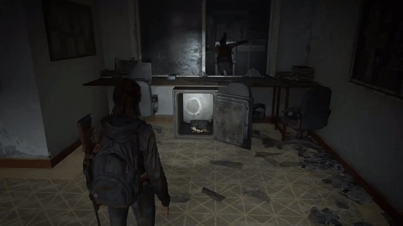
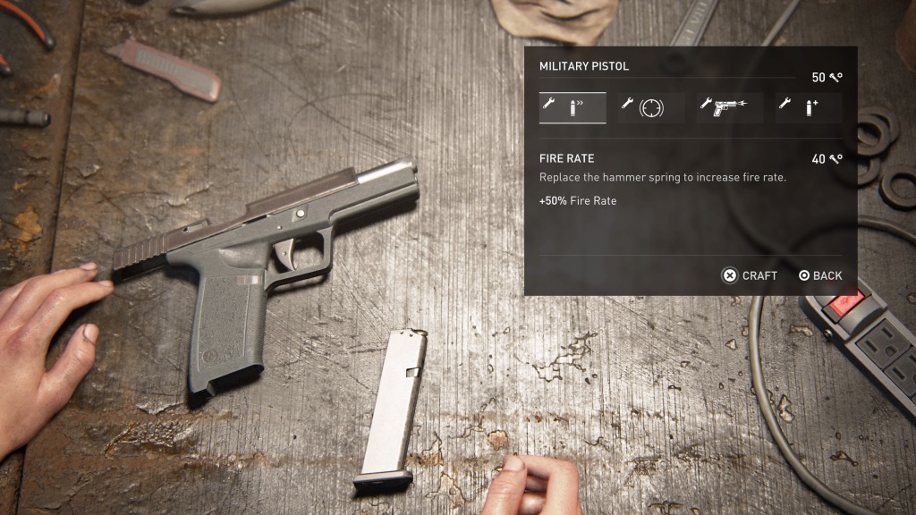
5. Crafting in game – The Last of Us Part II
In GOT, the player can only upgrade weapons and purchase ammo at certain locations e.g., the town’s swordsmith. TLOU2 on the other hand, allows you to craft vital items such as explosives and ammo at anytime – the only catch is that the game doesn’t pause. Crafting during gameplay (a common feature in survival horror titles) adds plenty of tension, especially when you’re frantically trying to put together a Molotov in the midst of an encounter.
6. Signalling low health and damage – both titles
Whether you’re fighting the well-armed Washington Liberation Front in Seattle or Mongolian warriors on Tsushima, it would be distracting (and risky) to constantly check your health at the bottom of your screen.
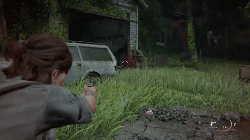
Both games aid the player by using meta components (filters on the 2D screen) to convey damage: red flashes show damage taken and an onscreen filter warns you that the end is near. Characters will also be visibly injured, and low health is conveyed to the player through hurt limbs, knockdowns and heavy bleeding.
Other interesting uses of the UI in combat include your character being incapacitated by an enemy arrow (until it’s pulled out) and the screen being temporarily obscured when an explosive goes off.


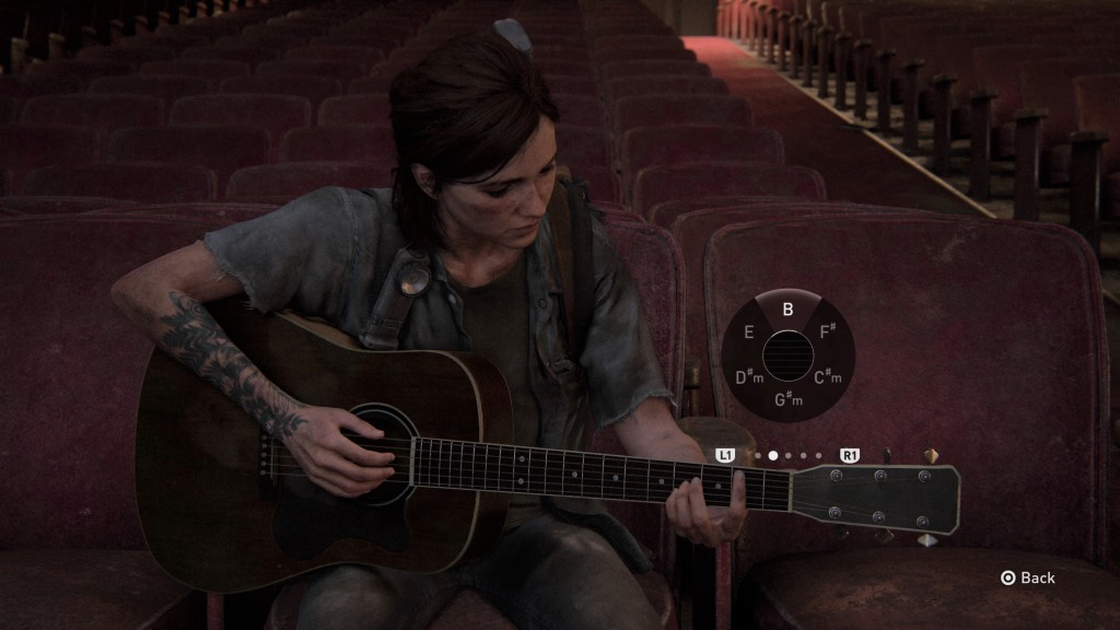
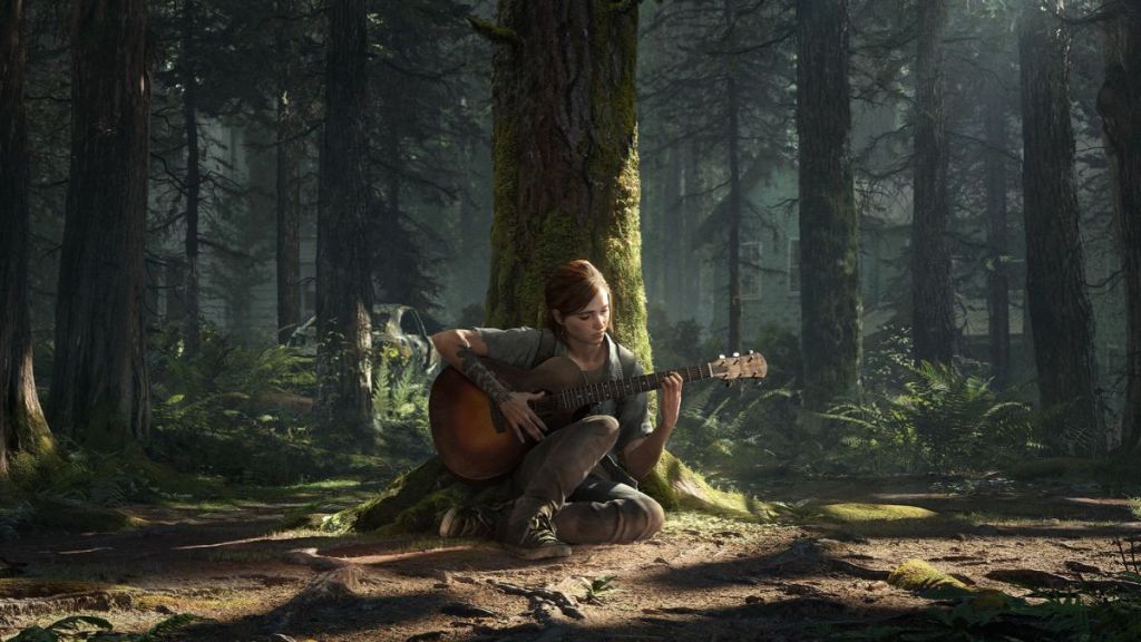
7. Game realism – The Last of Us Part II
TLOU2 is consistent throughout the game in its approach to realism, whether that’s weapons being upgraded in real-time or an accurate in-game representation of playing the guitar.

8. Reflecting the game’s setting through art & language – Ghost of Tsushima
In GOT, there are many nods to the distinctive Japanese art-style of the period; these include the game’s main menu, loading screens and puzzle maps found across the island.


The Japanese-audio option can also be selected so that characters speak in their native language. Although this dub doesn’t quite match up to the characters’ speaking animations (which were all lip synced in English), it does add another layer of immersion.
9. Honourable mention – enemy audio in both games
While not technically part of the UI, I have to give a shout out to the excellent enemy audio design in both games. In GOT, the invading enemy Mongols speak in their native language that isn’t translated via dubbing or subtitles – your character can’t understand Mongolian, so you’re not supposed to either. However, certain words -“Samurai!” meaning you’ve been detected, or “dooshoo!” shouted when an archer opens fire- are distinctive and act as helpful audio prompts.
In TLOU2, the Seraphite enemies (better known as Scars) communicate to each other in combat using a complex whistling system. Unlike earlier enemies (the infected not included), whose plans of attacks you can overhear and then counter, Scars are a formidable and unnerving enemy that can easily catch you off guard with their surprise manoeuvres.

The above list shows how a minimalist and innovative approach to UI design (with a focus on in-game visual cues) can create an immersive experience for the player. Both titles also use the UI to reflect the game’s setting and core gameplay; GOT is a free-flowing experience that interweaves cultural and historical elements with its UI, and TLOU2 puts emphasis on mirroring the real-world as much as possible through authentic animations and in-game actions.
Tips for full immersion in The Last of Us Part II and Ghost of Tsushima
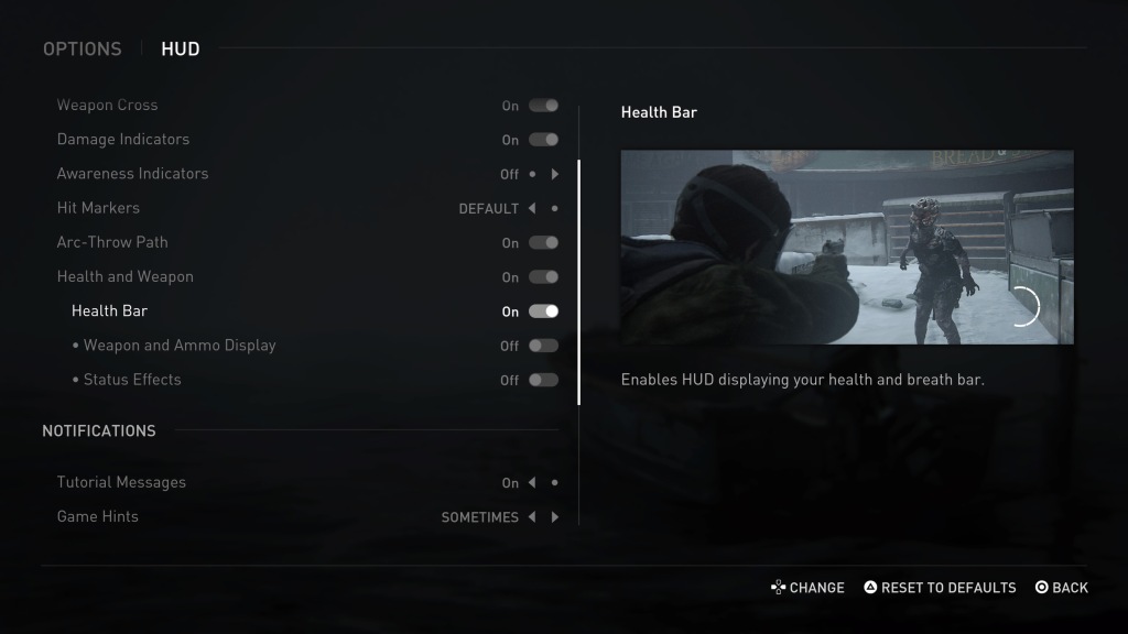
Both games have a Listen Mode/Focused Hearing mechanic that allows you to reveal enemy positions through obstacles. I thought this broke the immersion, so I’d recommend trying not to use this and instead rely on audio cues to locate enemies. TLOU2 even has a Grounded difficulty that disables this sixth sense and significantly reduces UI elements making it a much more immersive (and challenging) experience!
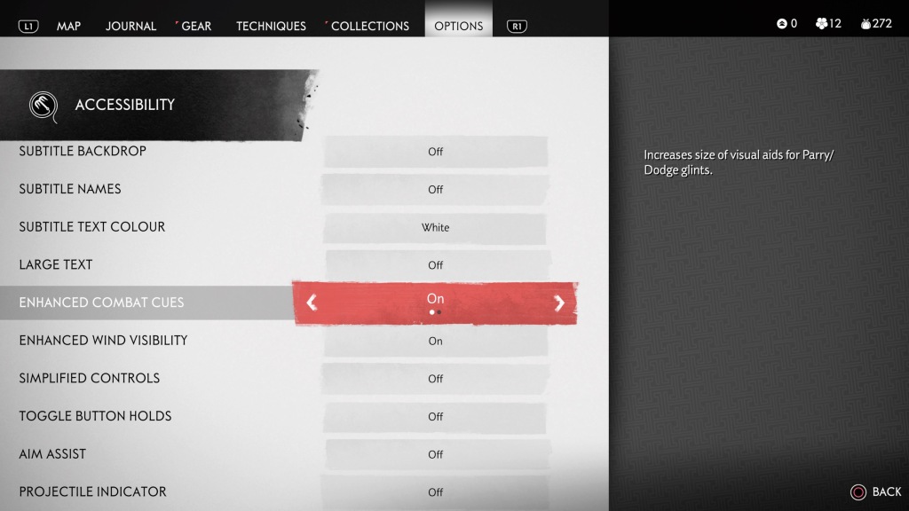
The UI itself can also be customised and, as well as its accessibility options, GOT has an Expert HUD style that is an excellent option for those wanting an even less descriptive display. TLOU2 takes this a step further and allows you to fully customise the game’s UI, reducing and removing multiple elements as you see fit.
Did you find The Last of Us Part II and Ghost of Tsushima immersive? For what reason? Let me know below in the comments!
Image credits: Sony Interactive Entertainment